A new look for America’s favorite sparkling water
LaCroix Rebrand
LaCroix’s current packaging is busy, outdated, and disconnected from the lifestyle the company advertises. I rebranded the popular Midwest-based sparkling water to better align with the company’s young target audience.

Skills
Package Design
Logo Design
Visual Identity Design
Tools
Adobe Photoshop
Adobe Illustrator
Adobe Dimension
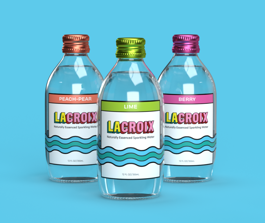
LaCroix’s bright new packaging breaks through the homogenous look of supermarket shelves and fits the modern, upbeat, positive lifestyle that the brand promotes.
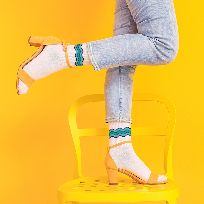
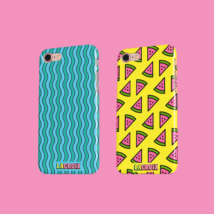
A cheerful and attractive color palette leads to a more recognizable brand, while bold graphics appeal to younger buyers.
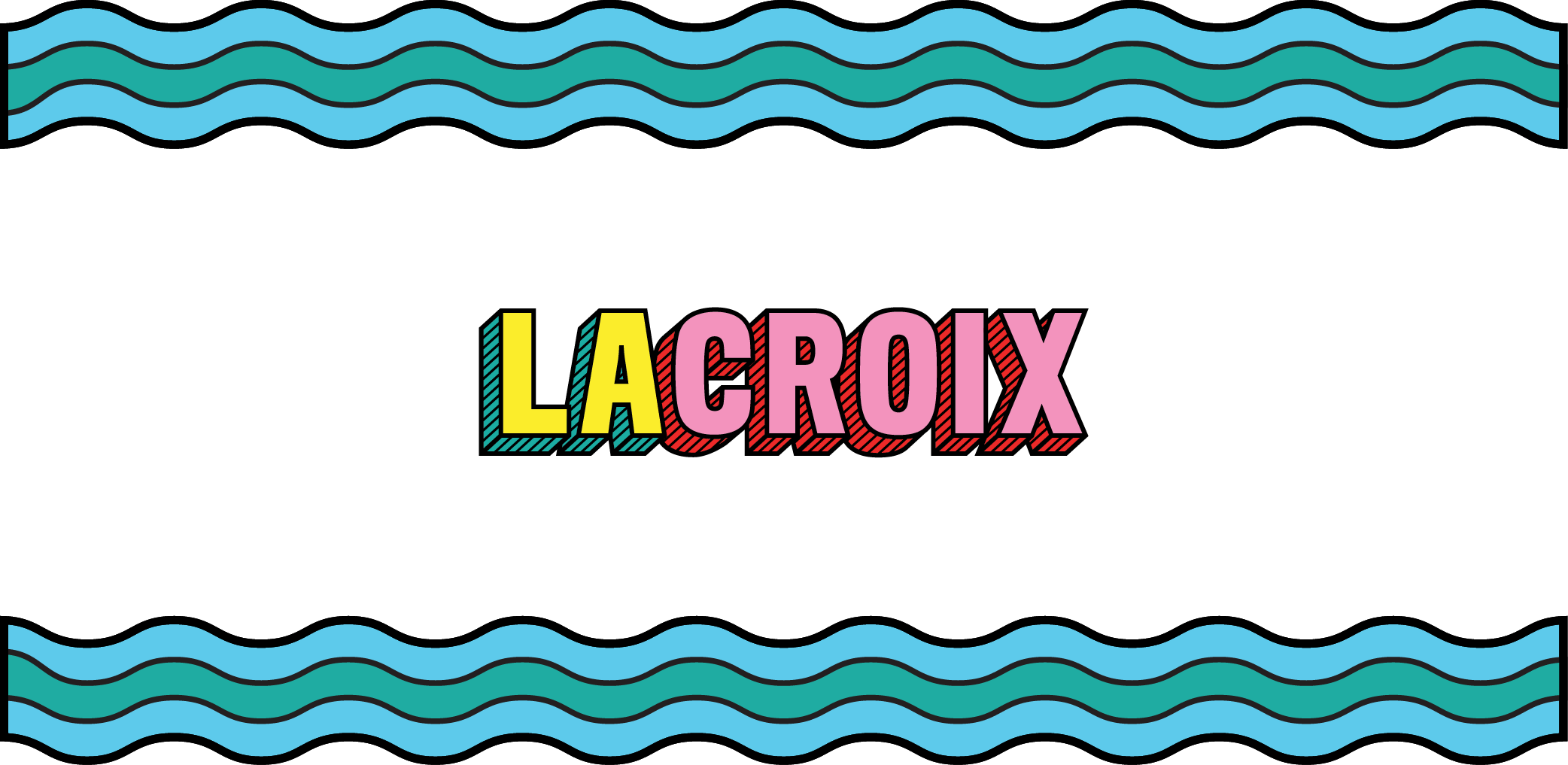
The water graphic ties LaCroix to both its product and its namesake, Wisconsin’s St. Croix River.
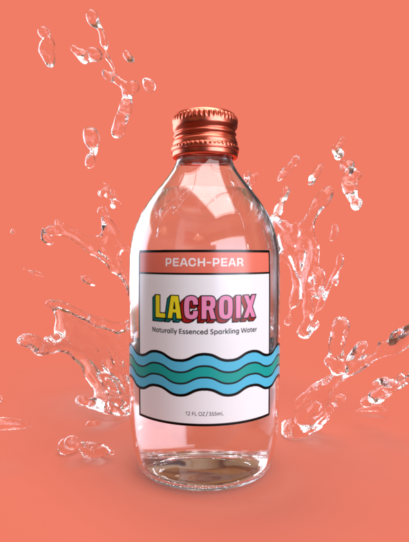
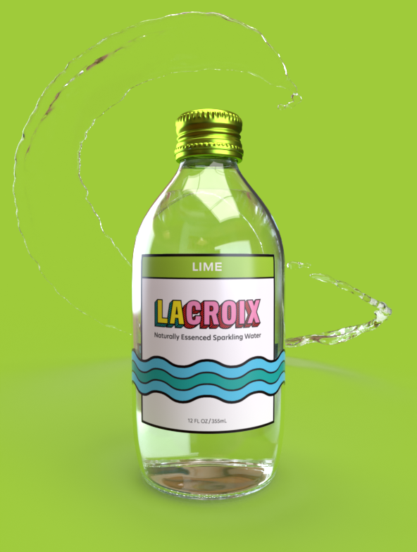
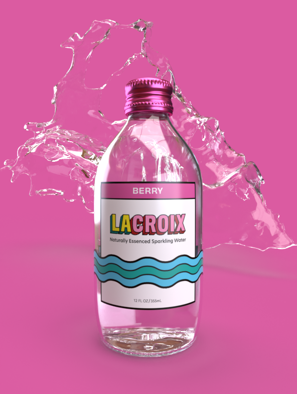
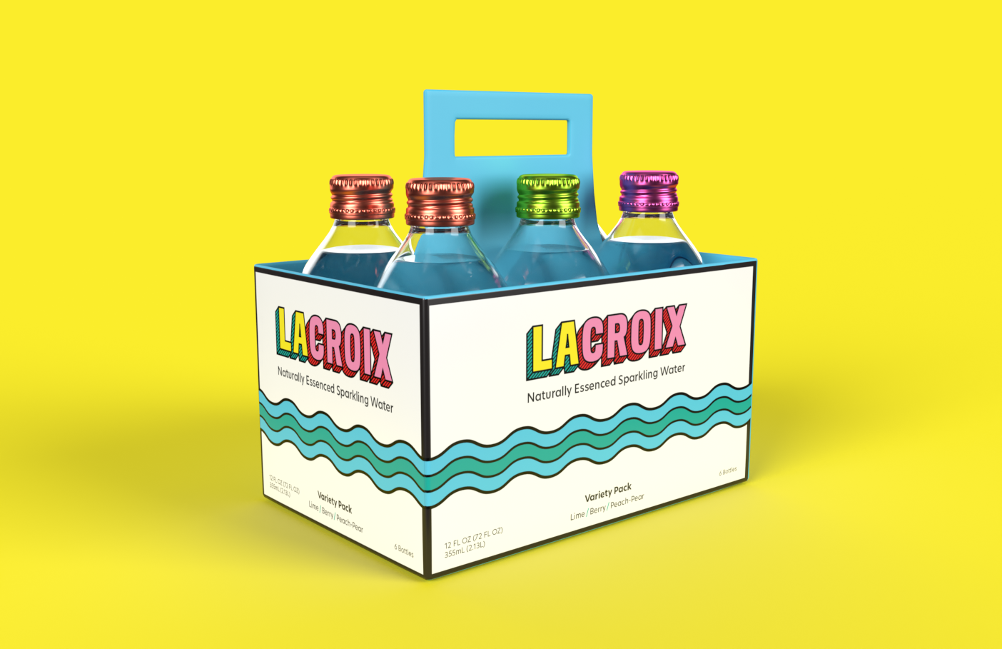
The use of glass bottles and an open carrying case allows customers to see what they are buying and gives texture to the towering wall of enclosed sparkling water boxes on store shelves.
